Typeface Creation and Poster Design
Process
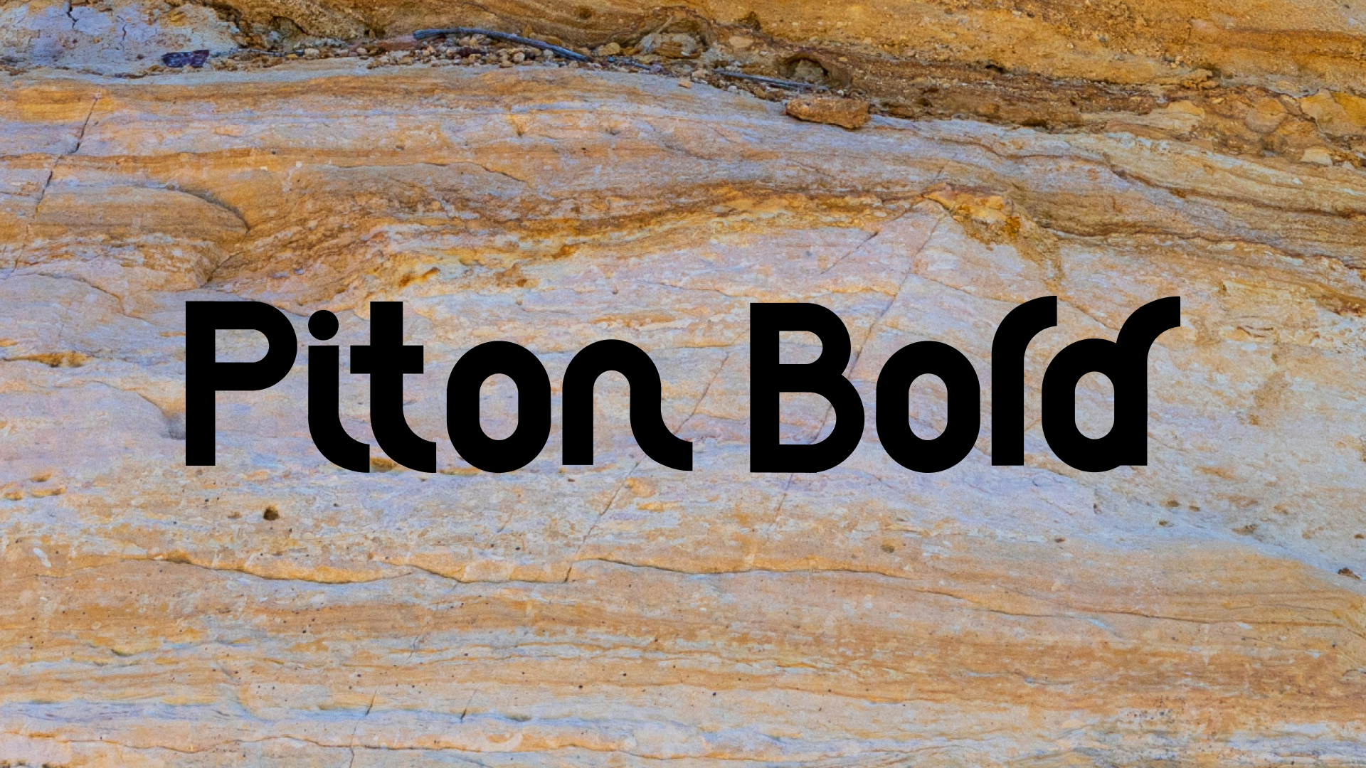
Typeface Creation – Piton Bold
Using Yvon Chouinard’s autobiography “Let My People Go Surfing” as inspiration, I created a typeface that evoked the feeling of the outdoors, natural and structured, that would work across various applications.
First Round – Digital
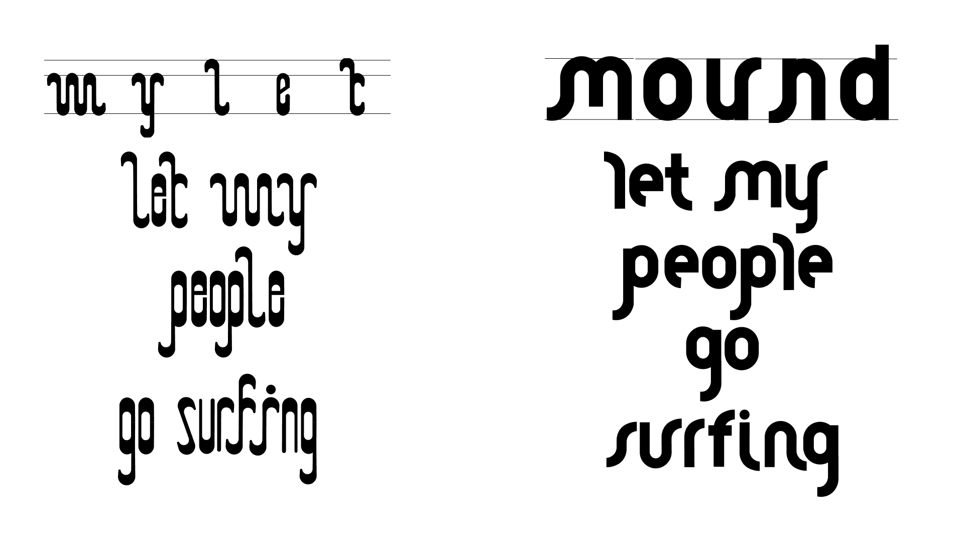
I settled on two different iterations that my keywords. I explored the forms further and created them digitally using Illustrator.
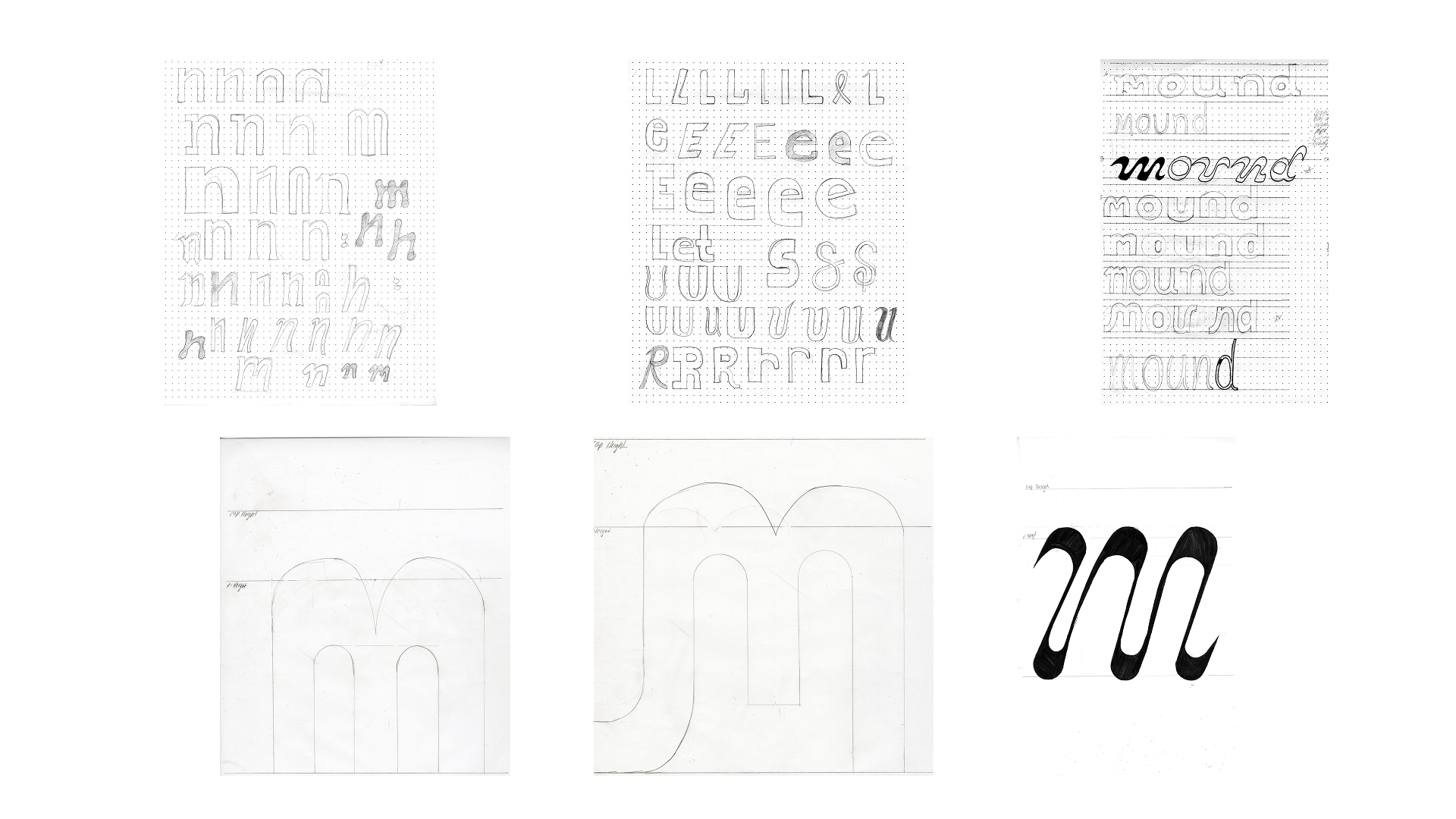
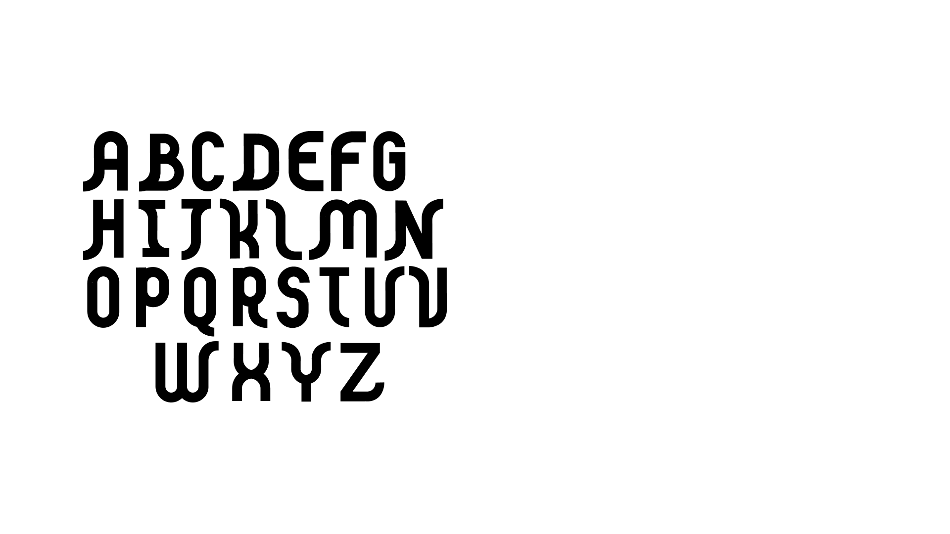
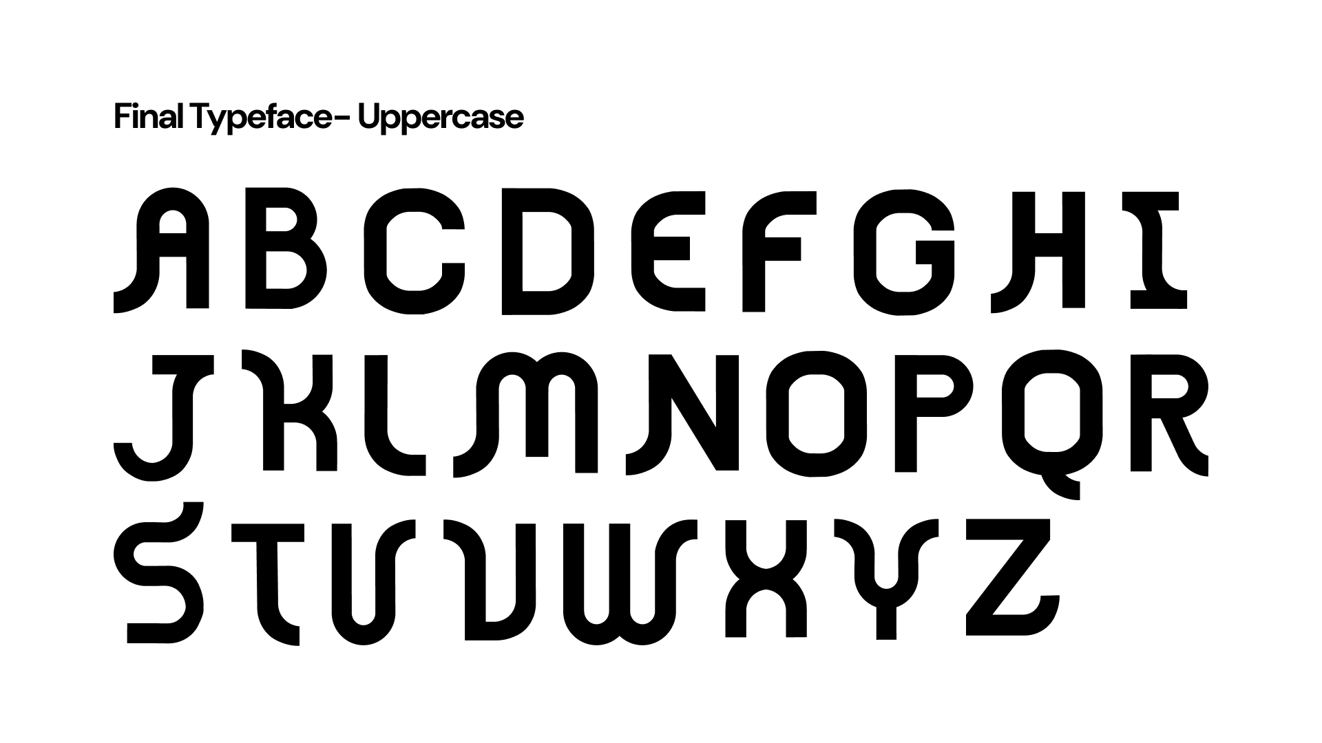
Typeface Evolution – Uppercase
The evolution for uppercase Piton Bold was more extensive, focusing on the way the uppercase letters interacted with each other and the set width as well.
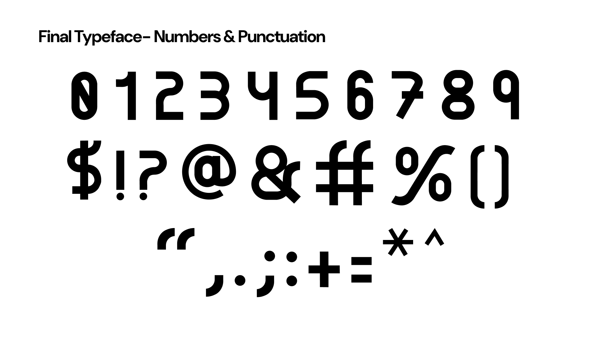
Numbers and Punctuation
The final step was creating numbers and punctuation for Piton Bold.
Initial Sketches
I began with sketches while keeping in mind my keywords of “natural and structured”. My goal was to find forms that were reminiscent of the flowing forms in nature.
Typeface Evolution – Lowercase
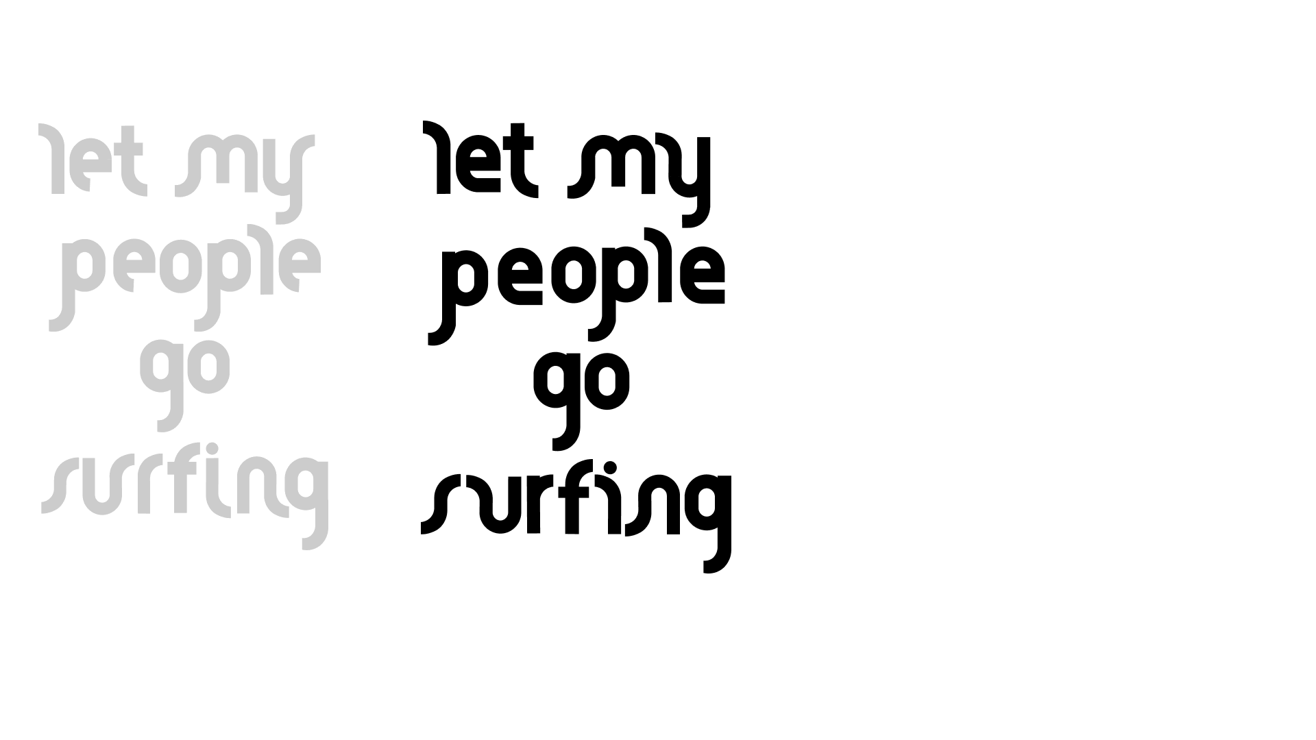
After deciding between both typefaces above I began refining
x-heights, stem width and kerning ultimately landing on the final lowercase version of Piton Bold.
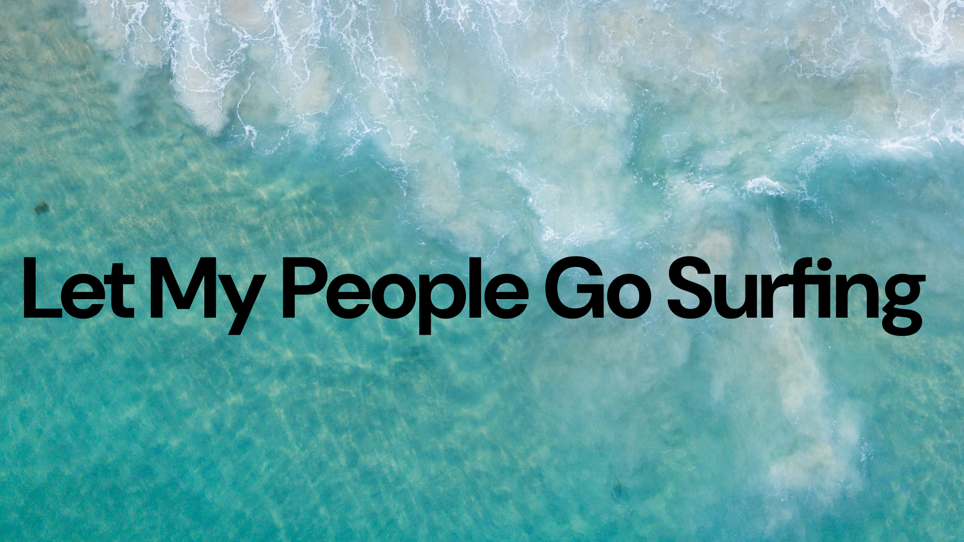
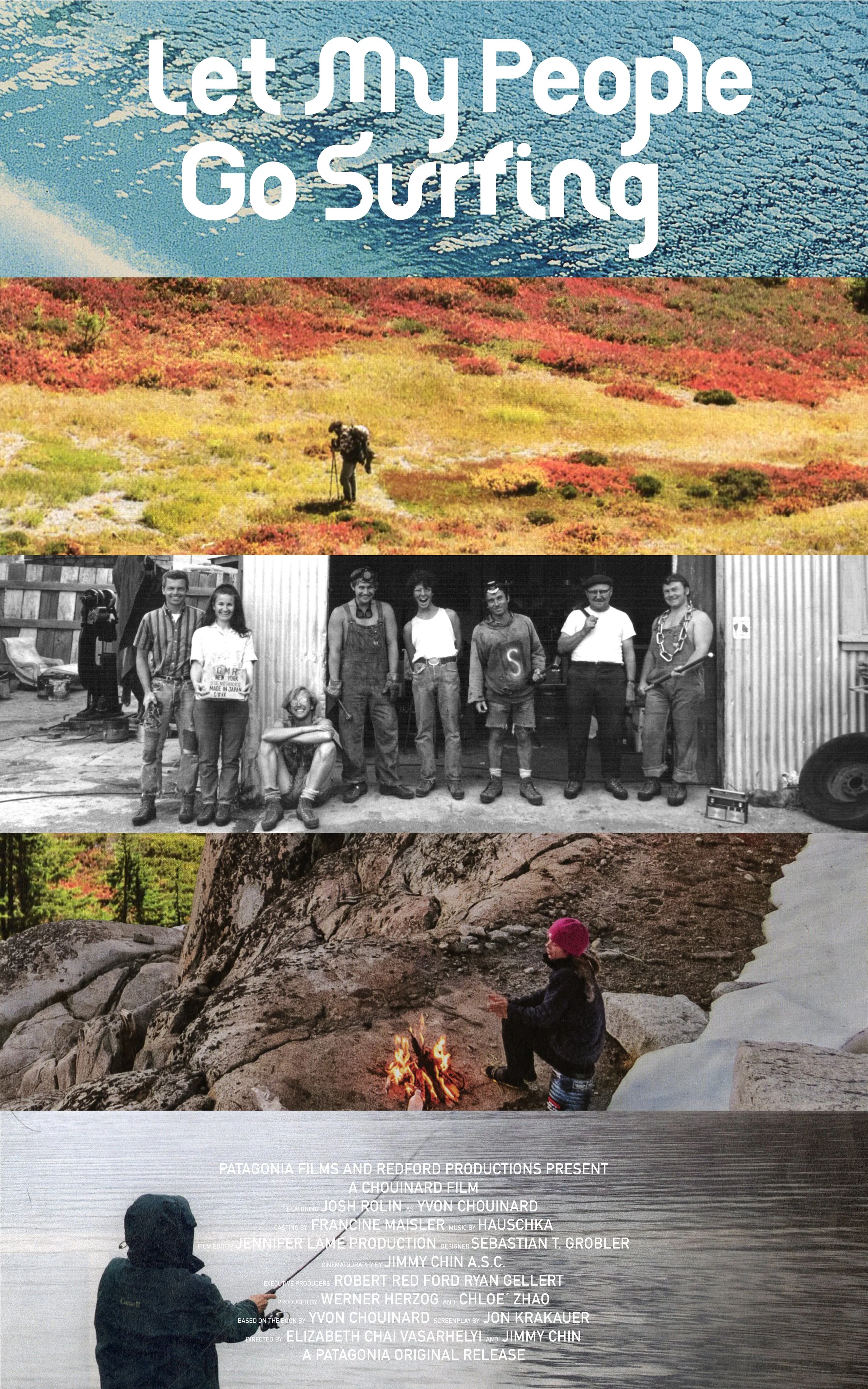
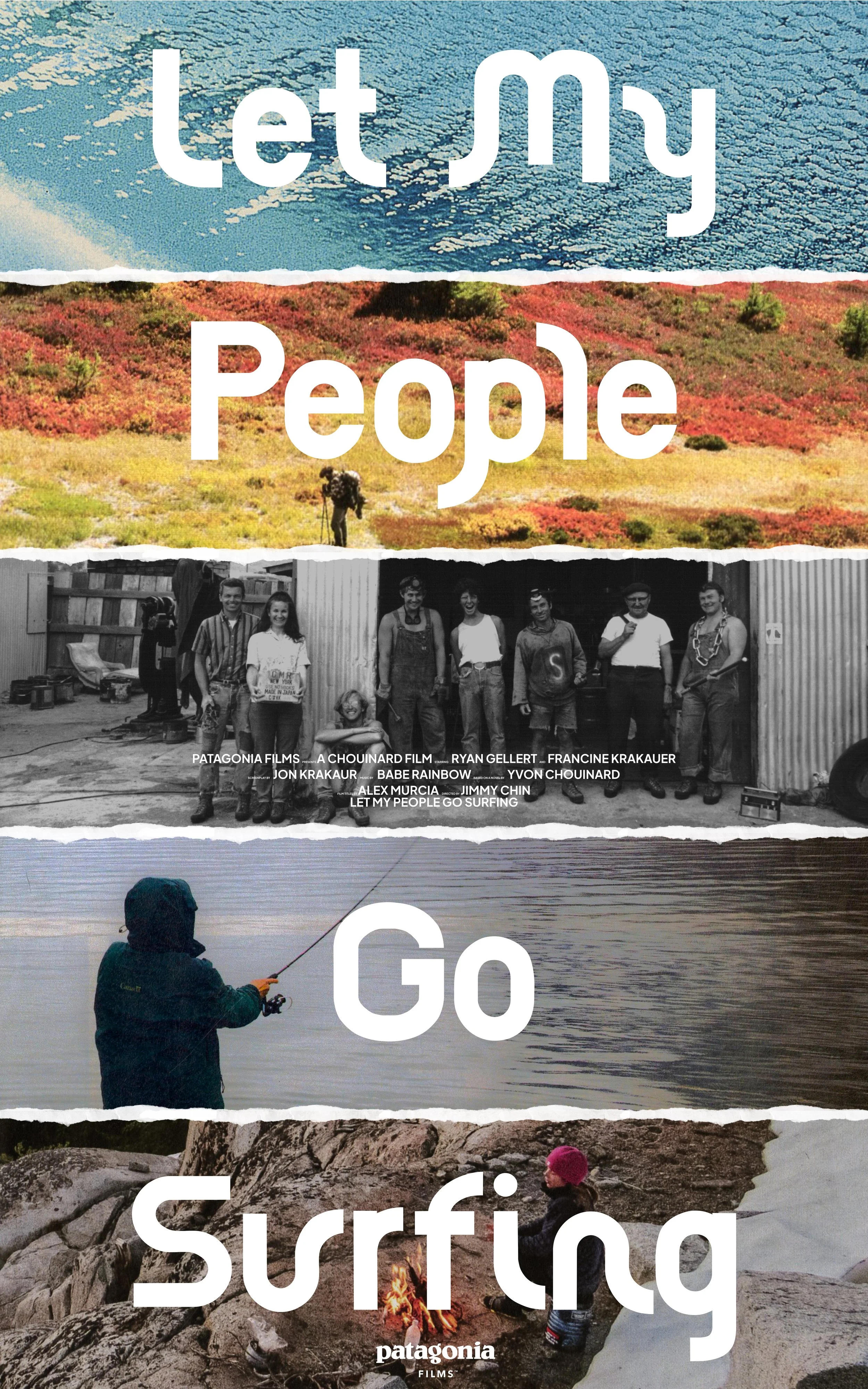
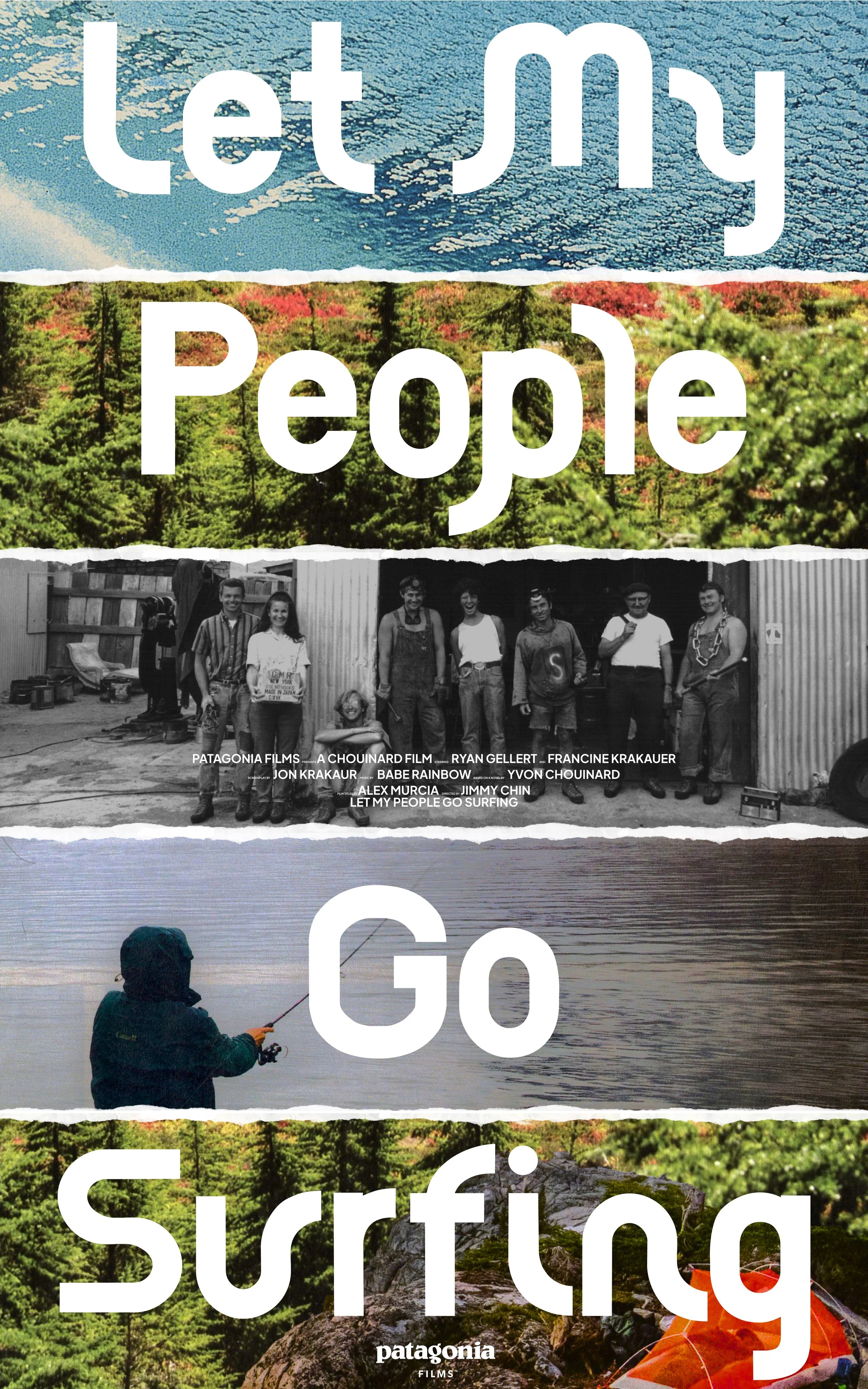
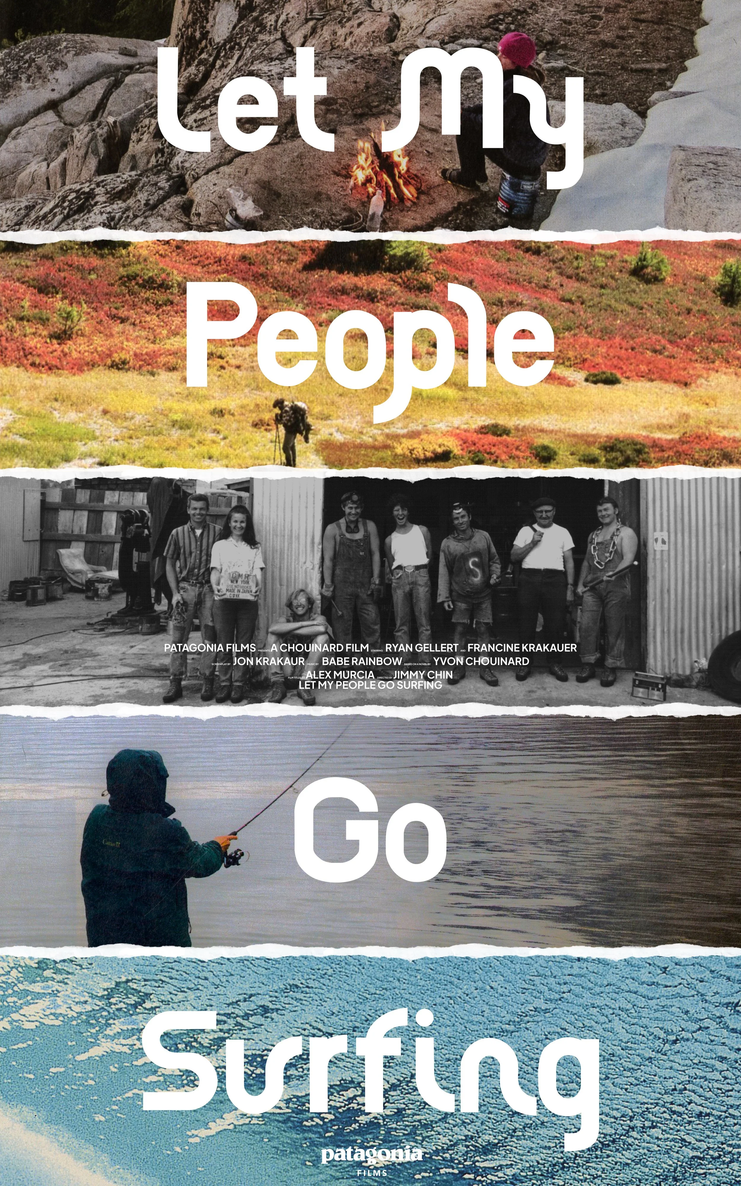
Let My People Go Surfing Movie Poster
After creating Piton Bold I applied the typeface to a movie poster for the adaptation of Yvon Chouinard’s book “Let My People Go Surfing”.
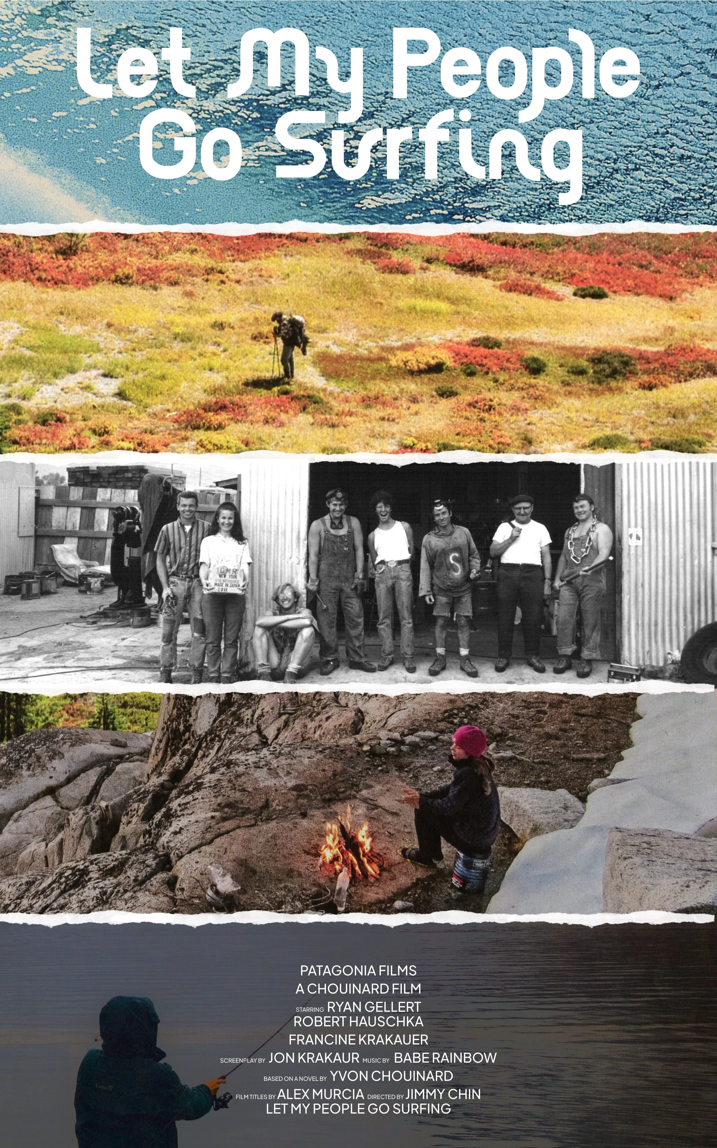
Version 01
Version 04
Version 03
DVD Package Design
Final Poster
Version 02
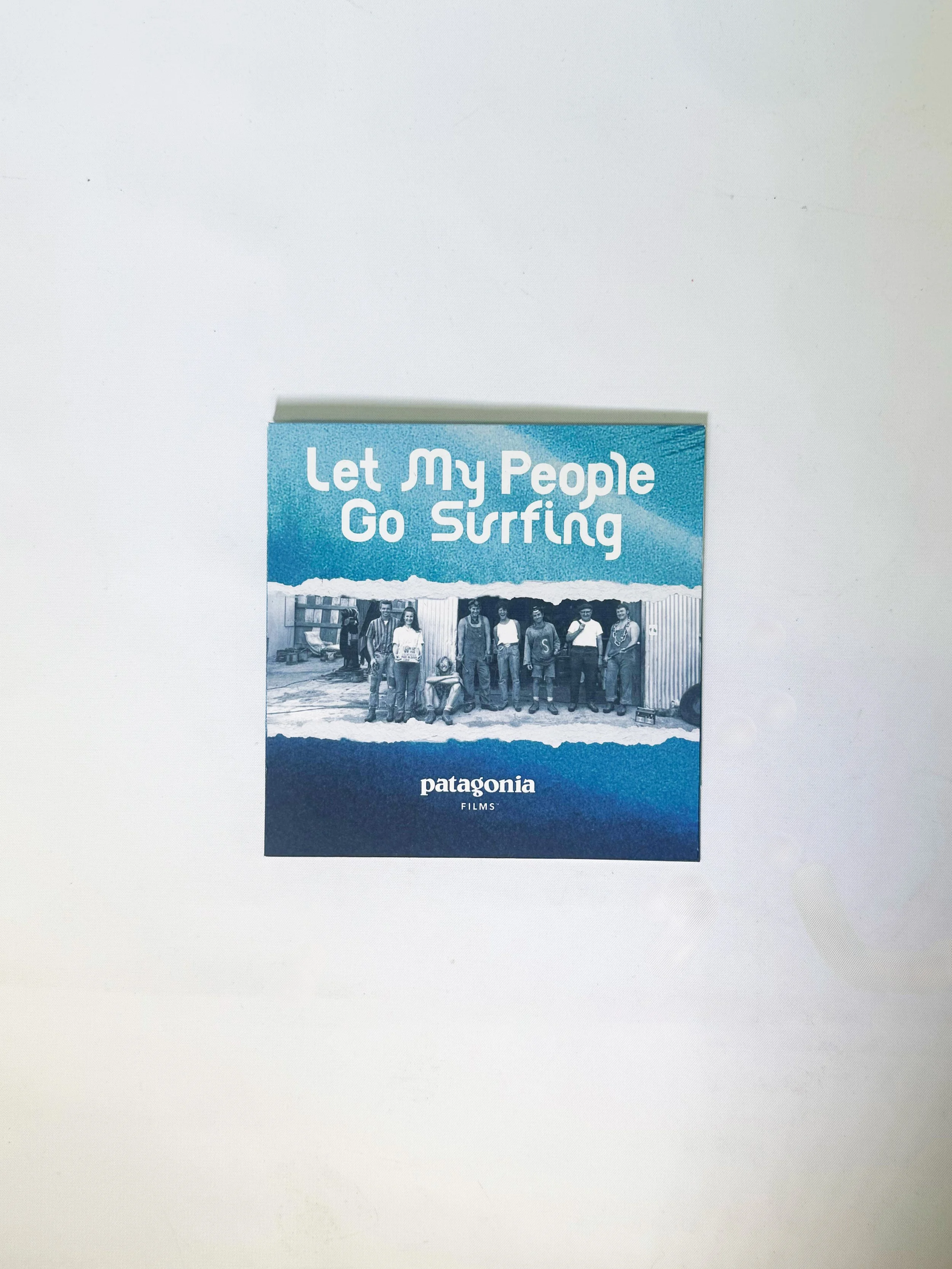
Created From sustainable Mohawk hemp paper, I created a minimal, Eco-friendly DVD case in-line with the core beliefs and practices of Patagonia.
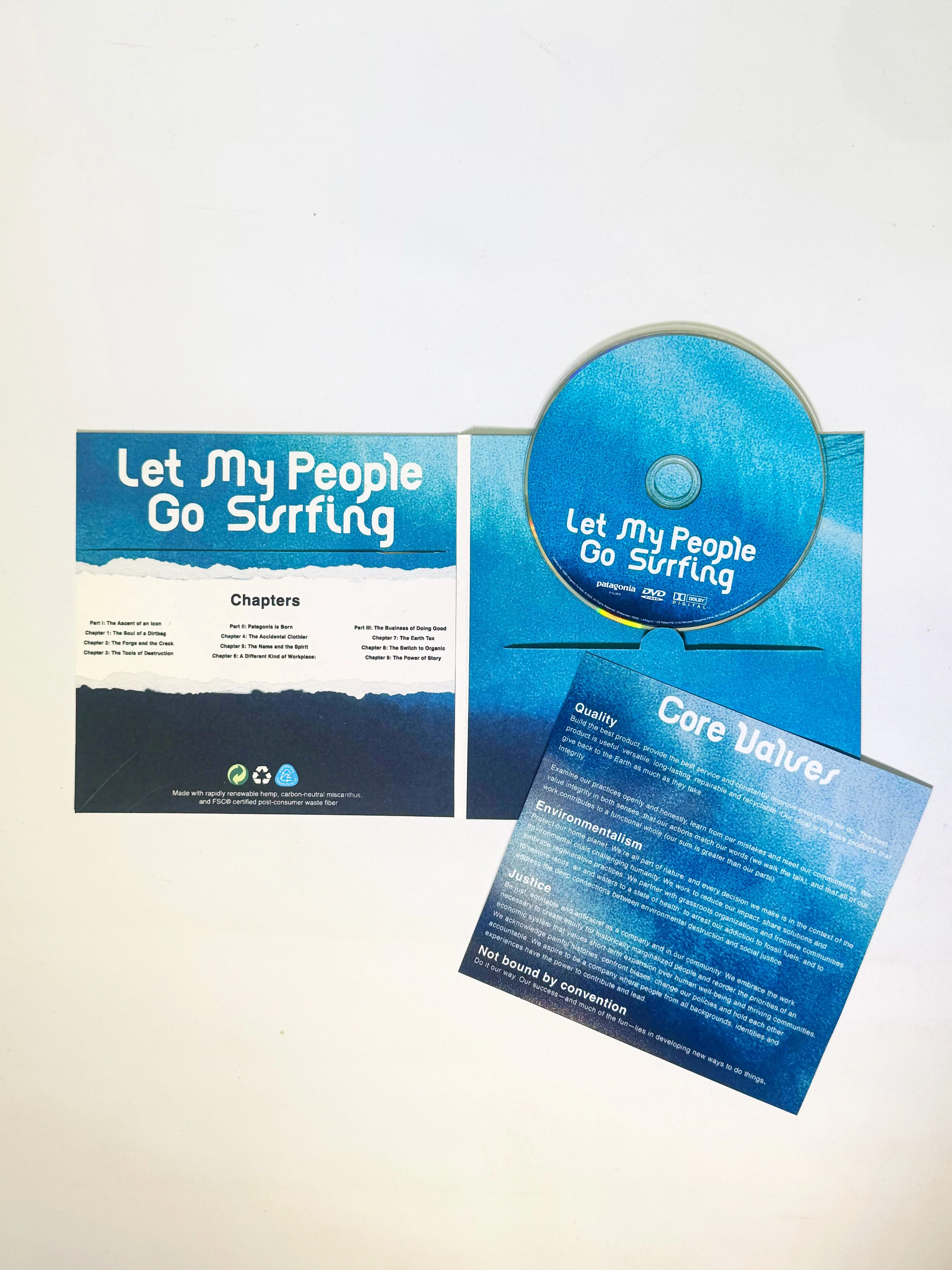
The layout and design remains consistent with the movie poster and also keeps in mind Patagonia as a brand.